In Use friction to your advantage, I talked about ways to nudge users toward desired—or away from undesired—behaviours. Take this idea too far, however, and you end up with Dark Patterns: UI tricks that deliberately deceive users.
E-commerce is full of bad examples:
– The “Only 3 Left In Stock!” badges that try to rush you into a purchase
– The awkward games and bonus points on the Temu app
– Cookie consent banners where the “Accept all” button looks like the only real option
You get the point.
But there’s a counter-movement to these deceptions that I’ll call “virtue signaling,” for lack of a better term. Here, you make the undesired action easily visible—not because you want the user to take it, but to show that you’re not trying to deceive them.
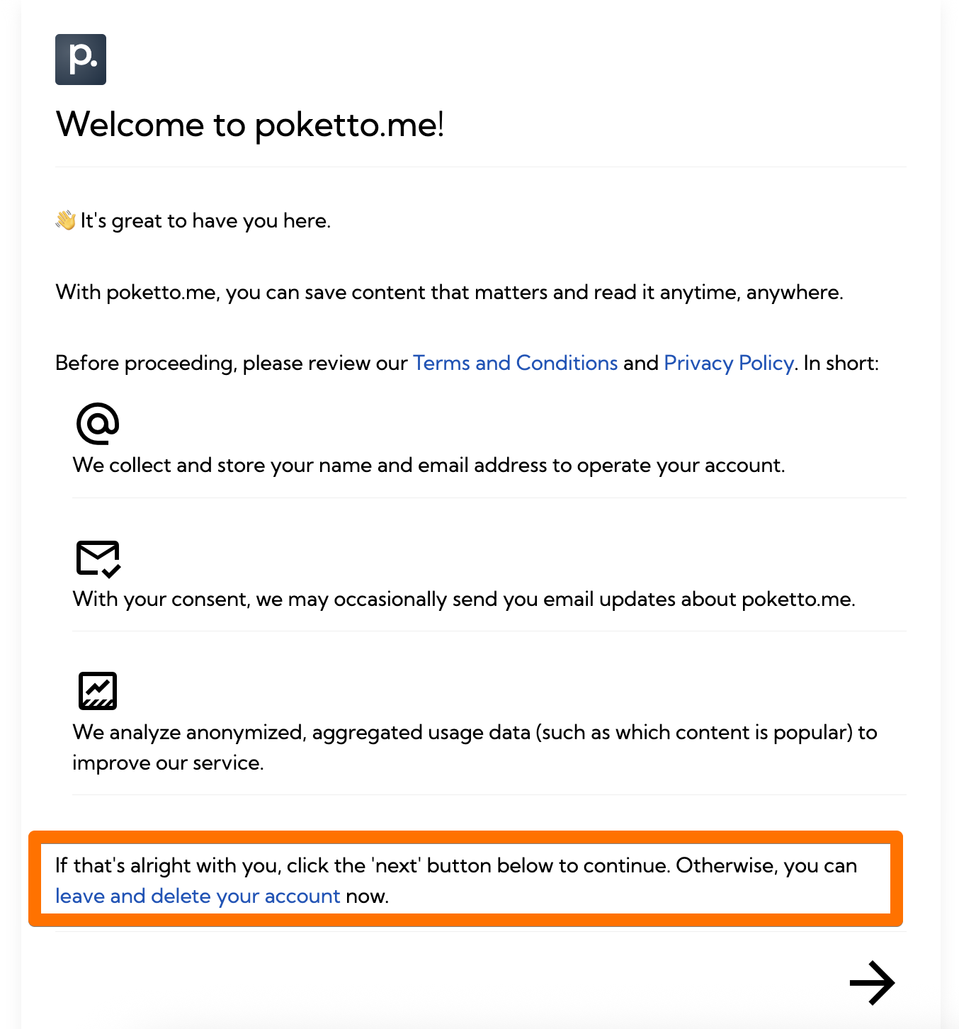
Some examples from poketto.me:
🚪 First-time use workflow: I make the option to “Leave now and delete your account” visible and prominent. Not because I want people to click it, but because it shows them there’s a clear exit if they’re here by mistake.
⚠️ Profile settings: The same option is only one click (and a confirmation dialog) away. Unlike, say, Facebook—where deleting your account feels like running an obstacle course—I want users to know they can leave any time, with all their data deleted and no questions asked.
💰 Subscriptions section: I added a banner encouraging users to email me with any billing, terms, or payment questions. The thinking: People are more likely to subscribe if they know there’s a clear, easy way to get help—or cancel—if needed.
Of course, I didn’t invent this idea. Frankly, I stole it from a well-known Austrian newspaper: Back when they ran radio commercials, they always highlighted that you could cancel “any day”, no strings attached. I’m not sure how many actually canceled—but it certainly drove sign-ups, especially when subscriptions were notoriously hard to get rid of.