One thing I was really looking forward to building for parlementrics was the data visualization piece. I just love it when data “speaks to me” through intuitive visualizations. Until now, however, I had never worked on a project that allowed me to embrace that idea myself. So, I dove into the task with gusto. But I soon realized that creating great data visualizations is much harder than it looks. In fact, the opposite is true. Great data visualizations make complex stuff look easy!
I started with just a handful of charts: The number of inquiries broken down by the initiating parliamentary fraction, the top questioners and recipients of inquiries, and the most frequent keywords and topics. However, that hodgepodge of bar charts never felt quite right. They showed the available data alright, but they were just… okay.
In search of inspiration, I turned to a classic, Infographics by Jason Lankow, Josh Ritchie, and Ross Crooks. While the book covers much more than just statistical visualizations, it provided a few useful pointers.
1. Colors
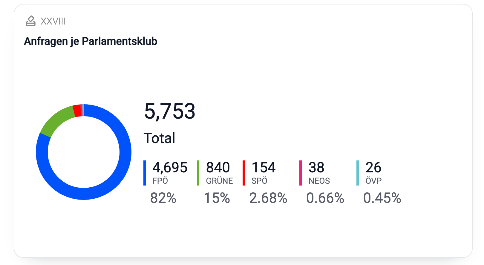
This one should be obvious, but… Colors matter. Using colors and color coding consistently greatly improves the readability of your visualizations. parlametrics provides a prime example: I use a political party’s recognizable color every time I can map something to that party, be that the parliamentary fraction itself, or a person associated with it.
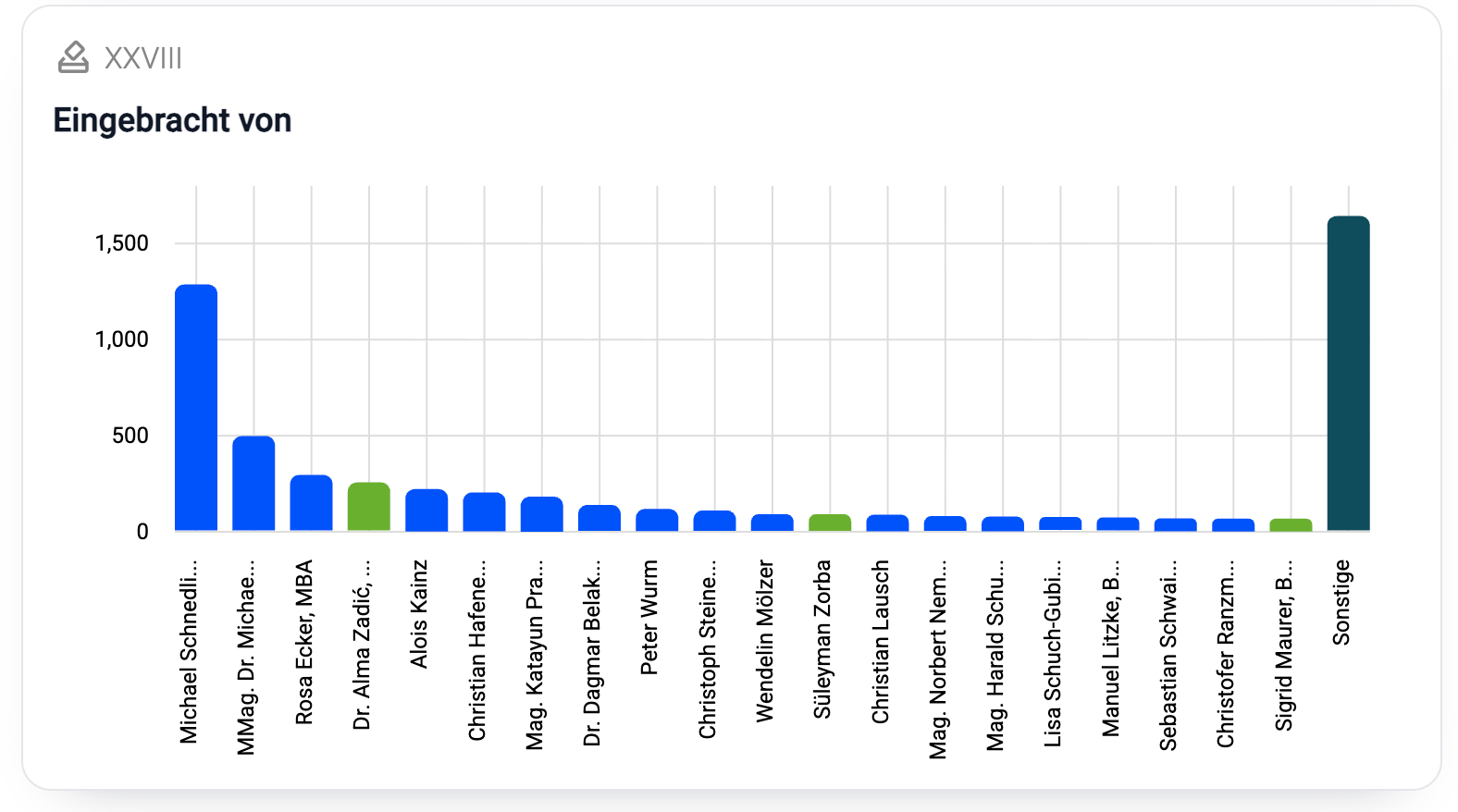
This also works wonders for the “per initiator” visualization. It’s just a simple bar chart, but color coding the questioner with their associated party color adds a second layer of information. At one glance, you can see that one fraction of the opposition asks a lot more questions than the other:
2. Appeal
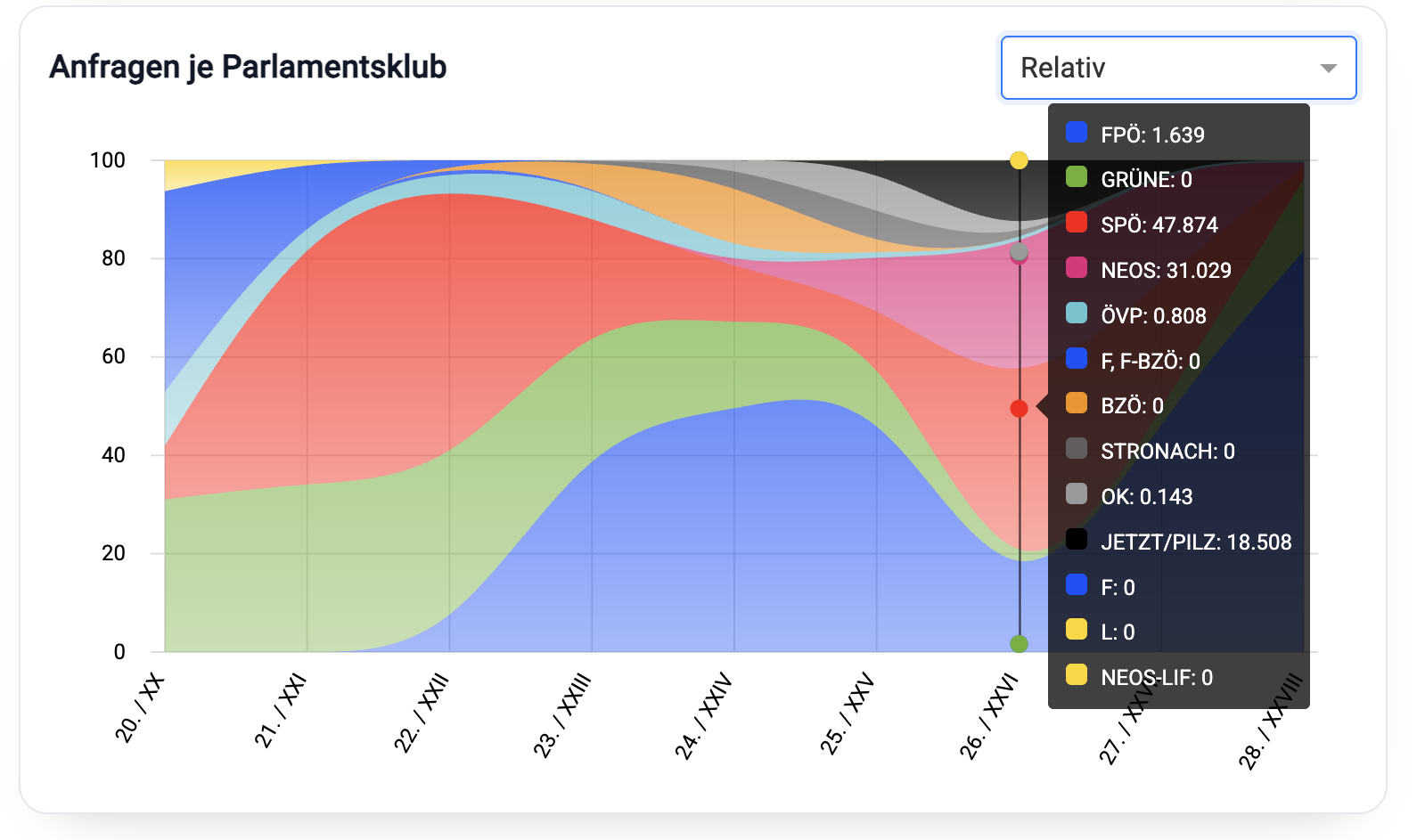
Visual appeal—whether you intuitively “like” looking at the visualization—also makes a huge difference. In the case of my “over time” charts, I even chose to sacrifice a bit of accuracy for visual appeal. Using a curved interpolation instead of a stacked bar chart makes it look much nicer. And you can still get to the full data by hovering over it.
3. Interaction
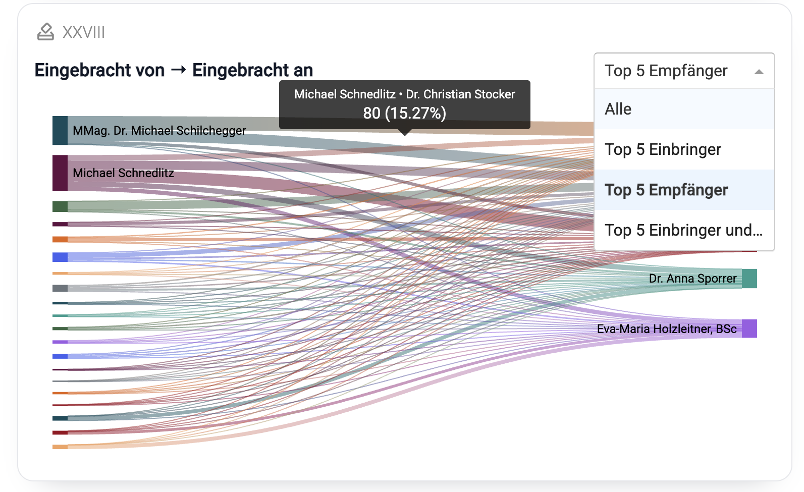
Have you ever noticed how “doing something” with data—even just clicking through it instead of merely looking at it—makes it stick in your mind better? There’s something about the tactility of interactions, even small ones, that primes our brains to absorb information. That’s why I was looking for small interaction elements like this one: Here, users can filter the “From/To” Sankey chart by “All,” the top initiators, or the top recipients.
4. Accuracy
Finally, here’s one that the kind people at the Austrian Parliament pointed out to me: Be precise with your language. Initially, I had used the term “party” quite liberally. For example, I called the first chart “Inquiries Per Party,” and I likewise attached each initiator’s and recipient’s “party” affiliation to them. However, this is not quite accurate. In parliamentary terms, “fraction” is the correct term. What’s the difference? In theory, at least, the two don’t have to overlap. Historically, we’ve had members of Parliament who were voted in on a particular party’s ticket and thus became part of that party’s parliamentary fraction. However, they were never card-carrying members of that party.
Summing up…
While I like the statistical aspect of parlametrics, this brief foray into data visualization has taught me how difficult it is to do it well. Honestly, I haven’t even scratched the surface. What about true “data storytelling?” What narrative is hidden in the data, and how do you convey it? Furthermore, AI adds a whole new universe of possibilities: How about dynamic, interactive, adaptive, and “chatable” infographics? What value would those add, compared to the simple, static, precomputed charts I’m showing now? Needless to say, I’m looking forward to find that out 😏